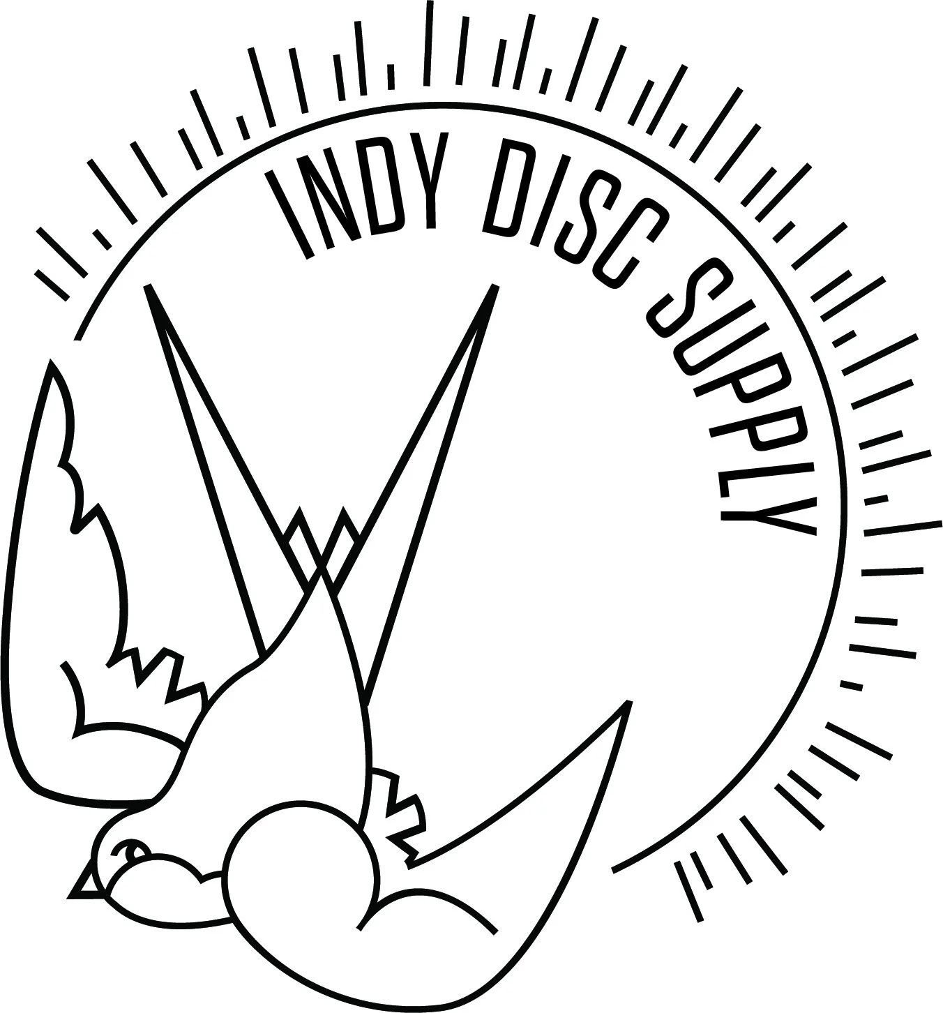
indy disc supply logo design
The logo and branding for Indy Disc Supply was created surrounding the brands goal of being fun, straight-forward, and simple. With the goal to reach younger millennials looking for a new outdoor adventure, we chose a simple design to stand out from the competitors.
The sparrow was used as the icon for the brand, which should the simplicity of the discs and the ease of picking up the sport. A sans serif font was selected for it’s variety in line-weights to carry into additional branding as well as it’s contemporary appeal.
Main logo design

Horizontal version of the logo with patch emblem

Creative Process
After an in depth look at the direction that the client wanted to go with the imagery chosen was of a sparrow flying overhead. First, we took a look at three different poses, showing the different shapes and angles of a bird in flight. Originally, we were looking at a top-down view, but after presenting three different shapes, the client liked the swoop in the second version shown below. We then tried some different definition and refinement of the shapes, but the original still stood out.

Three different formats were included to fit all of their printing needs.
